Health of the Market
(11/16/2024)
The charts will be updated by
every Saturday. When no change to text, [NC] will be used. Click
for favorite investment websites. This site
is part of
Charlottesville's The Center at
Belvedere Investors' Forum. Note:
If the latest date does not show here or
on charts, try
reloading the page or clearing cached images.

The indicators for the equity market show a down market within a bull cycle in a bull trend, and in a bull market (see definitions on Longer Term page). The Power Zone has started. November is generally good. The market will be volatile with Fed moving rates down and the election results. . Click here to check it out.
The S&P 500 index closed DOWN 2.08% for the week, after being up 4.66% the previous week. The Nasdaq index closed DOWN 3.15% for the week, after being up 5.74% the previous week. The small caps closed DOWN 4.05% for the week, after being up 8.74% the previous week.
69.6% of S&P 500 stocks were above their 200-day exponential moving averages, down from 75.4% the week before. 57.0% of these stocks were above their 50-day EMAs, down from 66.4% the week before. 43.7% of Nasdaq stocks were above their 50-day EMAs, down from 58.2% the week before (see chart).
[NC] A Bull Cycle started the week ending 11/10/2023 after a short bear cycle that started 10/20/2023. The previous bull cycle started 3/17/2023. A Bull Trend was signaled 11/17. A VIX buy Alert occurred on 11/7/2024, shown on the Market Status page. Charts for the fourth year of the presidential cycle are shown on the Cycles page. November is typically very good. It may depend on whether there is a split Congress.. Check out this analysis to see the what happens monthly in greater detail.[NC] The Power Zone, the favorable time of the year, has begun. The Power Zone typically starts sometime in October and ends sometime in May. See the Market Cycles page for more. The 10-year Treasury yield is above the 2-year yield, but below the 3-month yield, which is an inverted yield curve. This generally precedes a recession by several quarters. See more on the Income page.
[NC] This website follows the markets and does not presume to factor in economic conditions. Buyer beware!
[NC] Market timing is discussed on the Observations page -- does it work? Consider dollar-cost-averaging over a month or so to gain access to the market -- if you have missed the buy-low point (which most people do). Check out this article on how the market moves during the month. For traders, buy on the 27th and sell on the 6th. Or buy on the 10th and sell on the 18th.
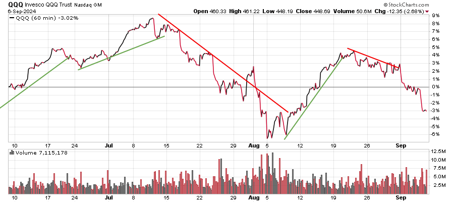
[NC] A
three-month performance chart of the Nasdaq QQQ
exchange-traded fund is
below. QQQ delivers a mash-up of tech, growth and large-cap exposure
that excludes financial stocks. The fund and index are rebalanced
quarterly and reconstituted annually.
[NC] The CNN Fear & Greed Index gives an interesting perspective on the internals of the market. The trend of the components of this index are important to gauge the trends of the market.
[NC]
A measure to
determine if the price is too high relative to the underlying
earnings is the Schiller price to earning ratio. This is the current
price divided by the 10-year average of "real" (inflation-adjusted)
earnings. This ratio corresponds quite well to the peaks of price
as shown by charts on this site.
[NC] John Murphy of StockCharts.com asks "Why do we look at charts?" - They provide the most up-do-date information on the state of the stock market. They may also be telling us something about the fundamental reports we won't be getting until much later. Charts track forward-looking markets, while fundamental data is backward looking. It's always safer to look out of the front window of your car while driving to see where you're going. Not the back window that shows you where you've already been."
[NC]
A chart from 1870 that shows the
major market swings can be seen here.
Stock Market Action
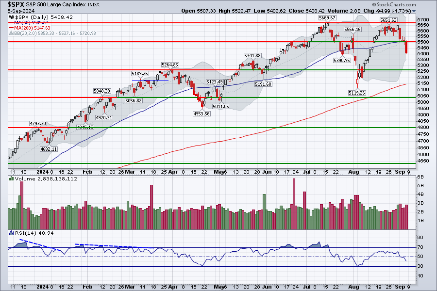
[NC]
The large-capitalization S&P 500
index is shown with its gray Bollinger
Bands below. The
bands are two standard deviations above & below a 20-day simple
moving average. When the price goes above or
near the edge of the upper Bollinger Band a downswing in
price
is likely as the market is overbought. Similarly, when the
price goes below the lower band, the market is oversold, and an
upswing is likely. The 14-day RSI is a measure of the price
momentum. Above 50 indicates positive momentum. A divergence
with
price is an indication that the price trend is likely to
change. The huge advance since the October 2023 low had several big boosts from Fed
announcements. The large-cap
market went up
to a new S&P 500 all-time high on 7/16 (and again 9/19}. Then it broke below the 50-day MA with a negative RSI momentum. Now,
after a vigorous rebound to the noted resistance and a drop again below
its 50-day MA. It broke above the previous resistance of the September
high and moved to an all-time high on 10/17/2024. After a correction, it shot up due to the Republican win. Now a correction to that big move has occurred to the support line.
[NC]
The
S&P 500 index is a capitalization-weighted index, meaning the
larger cap stocks are given the most weight
in the index. Market cap is calculated by multiplying the number
of stock shares a company has outstanding by its current stock price.
The stocks in the index include companies in eleven sectors to offer a
picture of the health of the U.S. stock market. However, the
six largest companies make up 27% of the value of the index.
These are Microsoft, Apple, Amazon, Nvidia, Alphabet (Google) and Meta
(Facebook). To get a clearer picture of what all the 500 stocks
are
doing, an equal-weight index can be used.
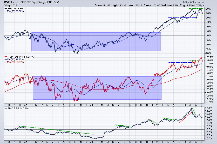
[NC]
The chart below shows an equal-weight performance version of
the S&P 500
(RSP) in red together with
the capitalization-weighted version (SPY) in black.
The relative strength plot at the bottom goes up when the SPY, driven by the mega stocks, is doing
better than the RSP.
Normally the market does better when the relative strength of the broad
maket indicated by RSP is doing better that the SPY shown by the green
trend lines.
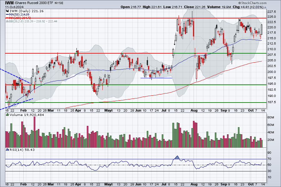
[NC] Small-cap stocks, represented by the iShares Russell 2000 Small Cap ETF (IWM), are not typically traded by computerized programs. They are traded by individuals and as such offer us a look at what individual investors are thinking instead of the big trading firms. Small caps hitting a new low tells us investors are selling, continuously selling. Not a good thing for the stock market looking forward. From FibTimer.com.
The
small-cap stocks do better with lower interest rates -- see the Income page.
After shooting up
on high volume in July, due to the Fed comments on a likely interest rate cut,
they eliminated those gains. The poor employment report on Thursday
8/1, caused a market melt-down.
The
index bounced off the 200-day MA and then recovered. Then there was an oscillating rise. It recently dropped to the 50-day rising MA. Then it shot to new highs after the election and the Fed lowering it's rate 0.25%. A severe correction to that move is occurring.
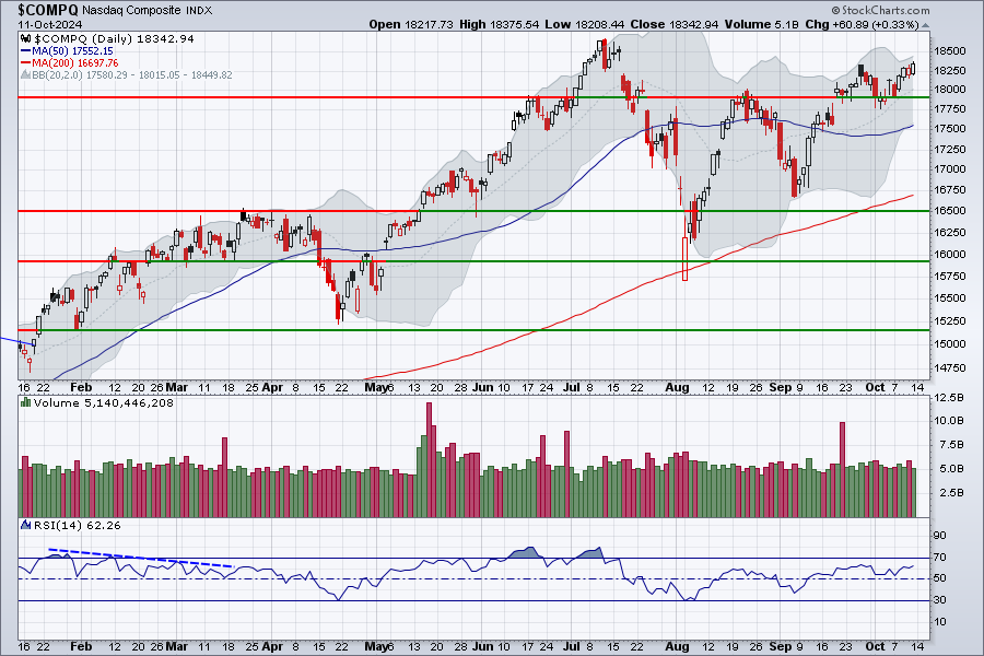
The
technology-heavy Nasdaq composite
index had
a major drop in July that took the index down to the 200-day MA. After
a
bounce and correction, it went back to the high of July. The mega-tech
stocks were back in favor, however their earnings report was
not the best and the market dropped. The Republican win caused a rally to new highs. A correction to that rally is now occuring with a move to the support line.
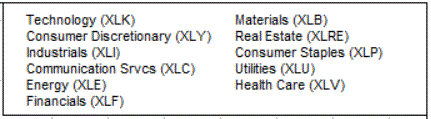
[NC] Sector investing via exchange traded funds (ETFs) is popular. The traders rotate between sectors. To see how some popular sector ETFs are doing, click here for the Candle Glance of two-month charts. The charts include the StockCharts Technical Ranking (SCTR). The sector ETFs used in the Candle Glance are these.
[NC] The international bond market is provided
by the WSJ. See the Income tab for a chart of U.S.
Treasury yields. 2020 ended with the 10-year treasury note at 0.93% and
the 2-year note yield was 0.13%.
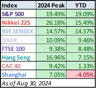 [NC] The
stock markets in other countries can diversify a portfolio. To
participate in these markets, the U.S. dollar
can be hedged out. Click to check out the country hedged ETFs and the un-hedged ETFs.
[NC] The
stock markets in other countries can diversify a portfolio. To
participate in these markets, the U.S. dollar
can be hedged out. Click to check out the country hedged ETFs and the un-hedged ETFs.
[NC] Note that BSE SENSEX is an India index, CAC 40 is France, FTSE 100 is a UK index, Nikkei 225 is Japan, Hang Seng is Hong Kong, DAXK is Germany, and Shanghai is, of course, Shanghai.
Dollar Influence
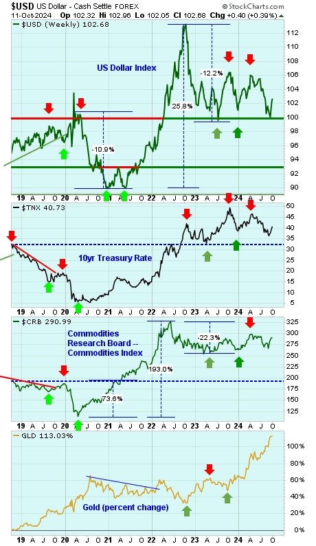
[NC]
The
dollar ($USD) and the 10-year Treasury rate ($TNX /10) are shown in a
6-year
chart with weekly closing prices. The earlier dollar rise peaked
in March
2020. The quick 10.8% drop ended with a double
bottom in the spring of 2021. The huge 25.7% rally since then corrected
with a 12.3% drop and then a correction and consolidation of that drop.
[NC] The 10-year Treasury rate rose to a peak on 10/5/2018 and 11/8/2018 closing at 3.23% both times. It hit a low in March and August 2020 around 0.5%. Now it is on a long-term rise.
[NC] Ed Yardeni in the 2/9/19 Barron's stated that, based on his 40 years of experience, he has never found that supply-versus-demand analysis helped much in forecasting bond yields. It's always been about actual inflation, expected inflation, and how the Fed was likely to respond to both.
[NC]
Also shown is the CRB Commodities
Index, which is a measure of inflation. This index is an unweighted
geometric average of prices across 17 commodities including energy,
grains, industrials, livestock, precious metals, and
agriculturals.
[NC] The price of gold
had
risen dramatically until the 2-year pull-back. Then the
uncertainty in the market and potentially lower interest rate pushed
the price of gold higher again. Now the long-term rates are moving up
and the stronger dollar are causing the gold price to drop somewhat.
[NC]
The Federal Reserve controls the Federal Funds
Rate, which is the interest rate at which banks lend reserve balances
to other depository institutions overnight on an uncollateralized
basis. It also tends to effect longer-term rates. On 3/15/2020 an
emergency
rate cut set the benchmark interest rate between 0% and 0.25%. Then the
Fed is raising the rate as shown in the chart.
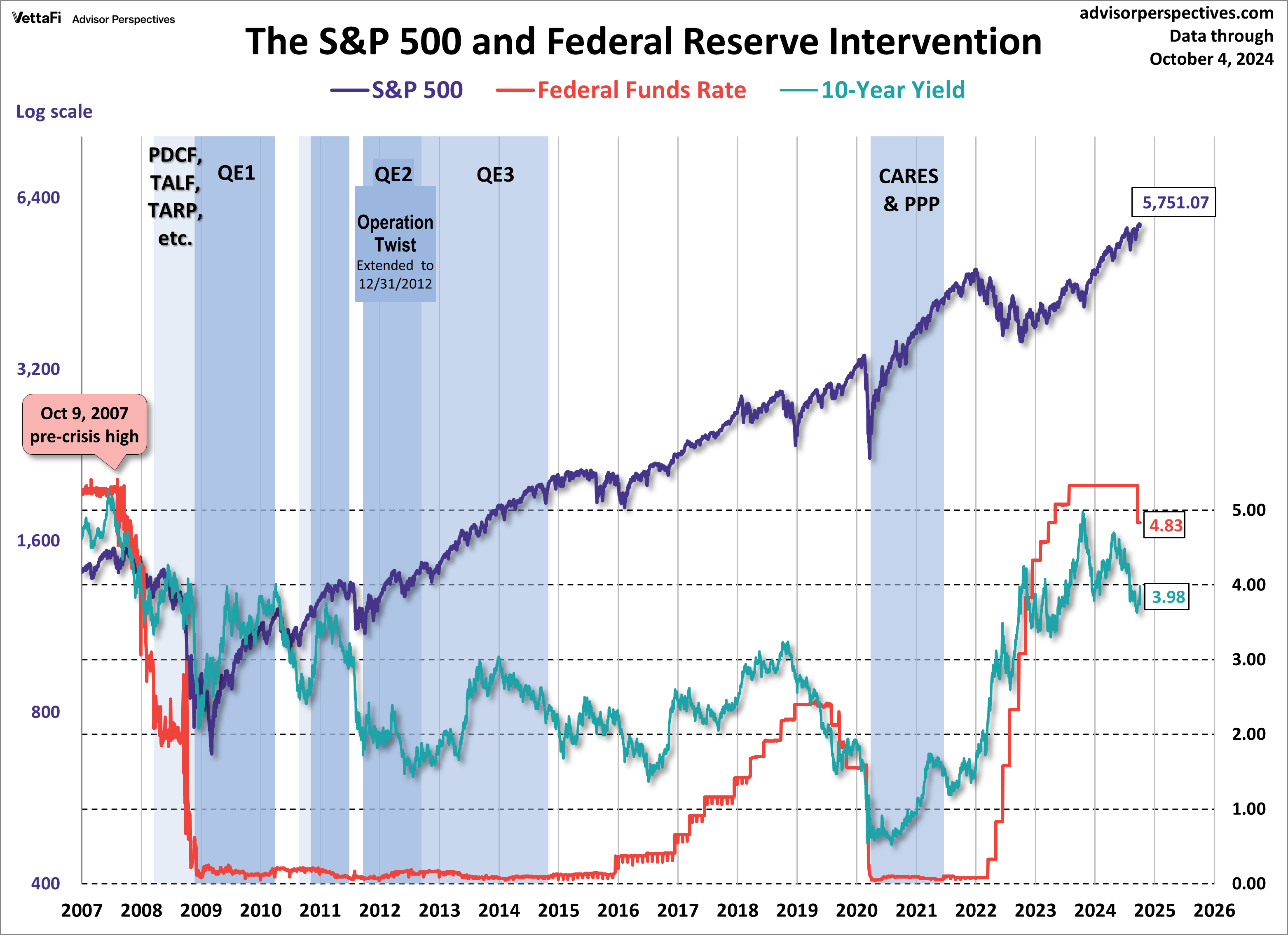
[NC] The
chart gives an overview of the
situation. The market had done well since the termination of the QE3
Fed bond buying, until the last half of 2015. The 10-year
Treasury rates moved down as the Fed raised the over-night Federal
Funds Rate in December 2015. There were a total of nine 1/4 point
rate increases, the last one in December of 2018. The Fed cut the rate
at its July 2019 meeting, and more cuts followed as shown below. In May
2022 the Fed started to raise the rate to slow the economy to fight
inflation.The rate increases have now halted and there is speculation as to when they might start falling. A
chart of
various Treasury yields
since 1962 are shown on the Income tab.
Click here to go back to the top.
The source of the charts is located on the upper right of the chart. This page is for amusement only, and should not be taken as advice to buy or sell anything.