Market Status
The charts will be updated by
every
Saturday. When no change to text, [NC] will be used.
Stocks above their 50-day Moving Average

[NC] This chart shows the number of Nasdaq stocks
that are above their 50-day moving averages. The
horizontal lines at 20 and 75 are arbitrary, and sometimes tend to
indicate when a move is nearing an end. The Nasdaq
composite index ($COMPQ) is shown below on a percentage scale for
correlation.
[NC] When this indicator is near a
high extreme, it indicates an overbought market, but the market
can continue up. A drop near 20 indicates a very oversold market.
[NC] The
April 2023 high in the Nasdaq ($COMPQ) was not verified by the number of
Nasdaq stocks above their 50-day MAs. This is an indication that
the market will go lower. But maybe not as it went higher! In August there was a confirmation, not a divergence.
In 2024 the indicator was coming down from an overbought condition and the
market going up! Unusual. The
market was dropping fast in early April. The expected
correction to that drop turned into a new advance. The huge AI
stocks were dominating the index and moving up.
The majority of Nasdaq stocks moved up until December, especially the
large caps, as the
Republican wins in the election and the good earnings reports were
pushing
the market higher. Then a market dip has occurred due to the Fed speak,
and the concern that fewer rate cuts will occur in 2025. The concern
about AI and the simpler approach introduced by DeepSeek was
moderating, but now the concern over Trump policies, especially the
tarrifs, are causing a drop. Less than 33% of the Nasdaq stocks are
above their 50-day moving average.
Bullish Percent Index
[NC] The Bullish Percent Index ($BPSPX) for the S&P 500 stocks is shown together with the S&P 500 Index ($SPX) in dotted blue. The Bullish Percent Index takes a group of stocks and records the percentage of those stocks that have a Point & Figure Buy signal from their point and figure chart. The BPI for the S&P 500 stocks is shown over a 1.5-year period.
[NC] The green buy pole indicates when the index goes above 30. The
red sell pole indicates when the index goes below 70. These seems to be
a good indication of future market action. When the bullish percent went down in early 2024, the SPX continued up due to the large tech stocks that make up 35% of the index.
The up move ended and on April 3rd the index dropped below 70
indicating
a likely significant drop in the market. But again the bull traders
moved the market higher on good Fed news and encouraging earnings
reports. After
a correction to that advance, the market continued up. The
large-cap
stocks are now back in favor so the market has stayed up pretty well,
however the market has had a pull-back sparked by the Fed-speak, the
concern that fewer rate cuts will occur in 2025, and the uncertainly of
Trump actions.
Sector Bullish Percent
[NC] Looking at the BPI of sectors is a good way to get a feel
for how they are performing. Click here to see charts for ten S&P market sectors.
Volatility
[NC] The Volatility Index (VIX) shows the large-cap
market's expectation of 30-day volatility. The index is based on prices
of S&P 500 options that investors tend to rush to when they are
fearful of stock declines. The VIX is a widely used measure of market
risk and is often referred to as the "investor fear gauge". When the
fear is highest, the market is likely to bottom and start up as
all those in fear would have sold. There is greater detail at Investopedia.com.
[NC] Below is a one-year plot of the
VIX with the S&P 500 on a percentage scale at the bottom. In
the middle is the RSI of the VIX. When the RSI hits the blue 60
line there is danger of a decline (starts with a red
vertical pole). When the RSI hits 45, green pole, the
probability of making money in the market can be much better. All
indicators lag the market, and are not good in a choppy market. A green
pole will not be placed if the VIX is above 20, and a buy alert
will be canceled if the VIX goes above 20. Note also that low
points in the market usually occur when the VIX peaks.
A VIX Sell Alert,
based on the volatility of large-cap stock action, occurred on 2/24/2025
(red pole). The previous buy alert occurred on 1/24/2025 (green pole).
The traditional view is that
it is dangerous to be in the market when the VIX is above
20.

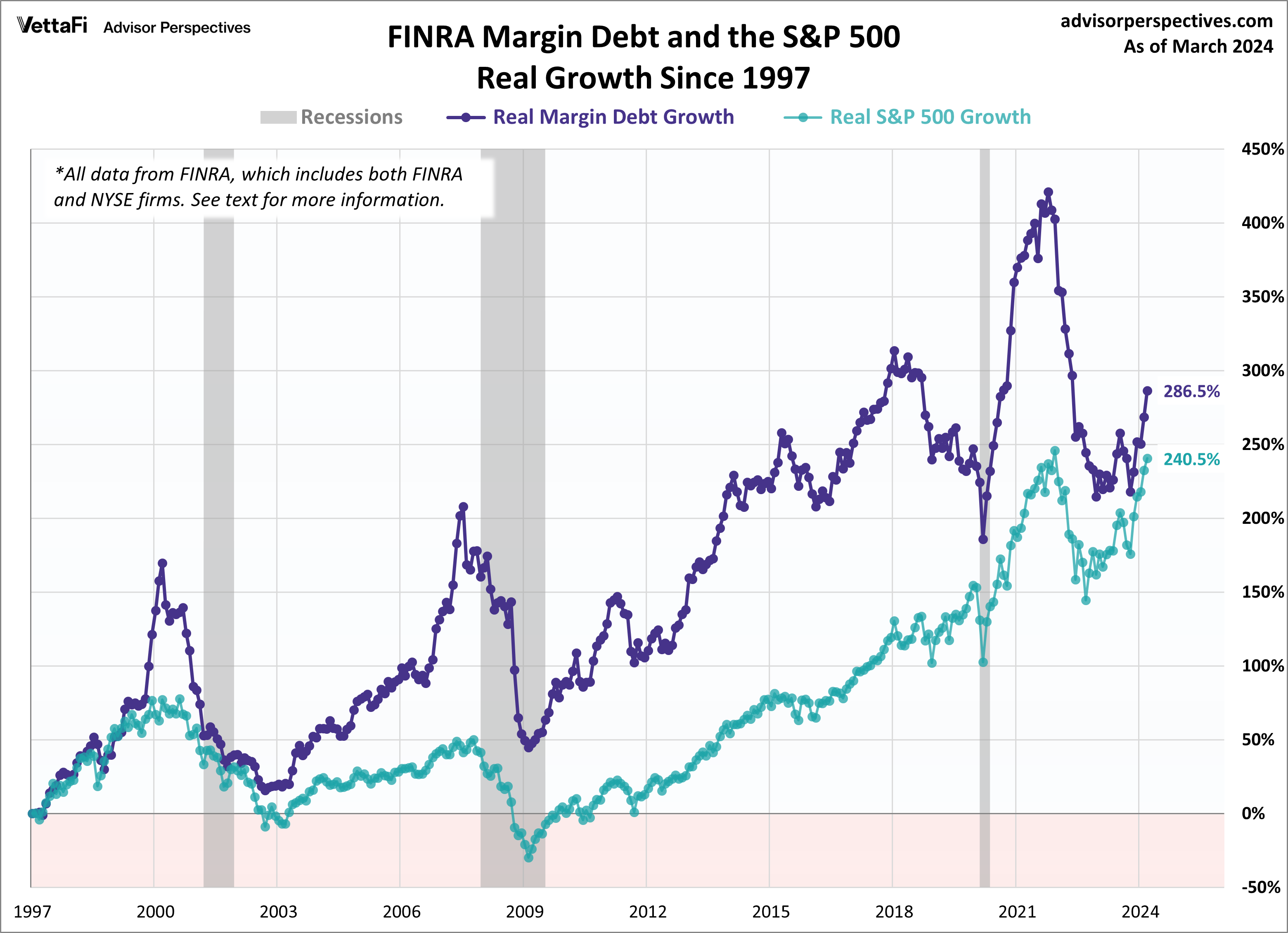
Margin Debt Impact
[NC] Notice the relationship of margin debt to the market.
This is the S&P 500 index. As Jill Mislinski states, "there are too few
peak/trough episodes in this overlay series to take the latest credit
balance data as a leading indicator of a major selloff in U.S.
equities. This has been an interesting indicator to watch and will
certainly continue to bear close watching in the months ahead."
This page is for amusement only, and should not be taken as advice to buy or sell anything.